Line end handling has been evolved to allow multiple typesetting options
Introduction
Vivliostyle.js was updated to v2.14.0 on February 4, 2022. Please refer to the following for details.
While the new version does not have the same prominent features as the JavaScript support introduced in the previous article, it does provide more options for East Asian languages, especially Japanese typesetting. This article will briefly explain its contents.
Evolution of end of line handling
Vivliostyle.js has implemented the text-spacing property of CSS Text Module Level 4 and the hanging-punctuation property of CSS Text Module Level 3 in v2.12.0 (2021-11-13). This allows us to adjust the spacing between words in Japanese/Chinese and European languages, as well as the spacing between consecutive full-width punctuation marks. Considering that text-spacing is not yet implemented in any browser, and hanging-punctuation is only implemented in Safari, this is a very ambitious effort.
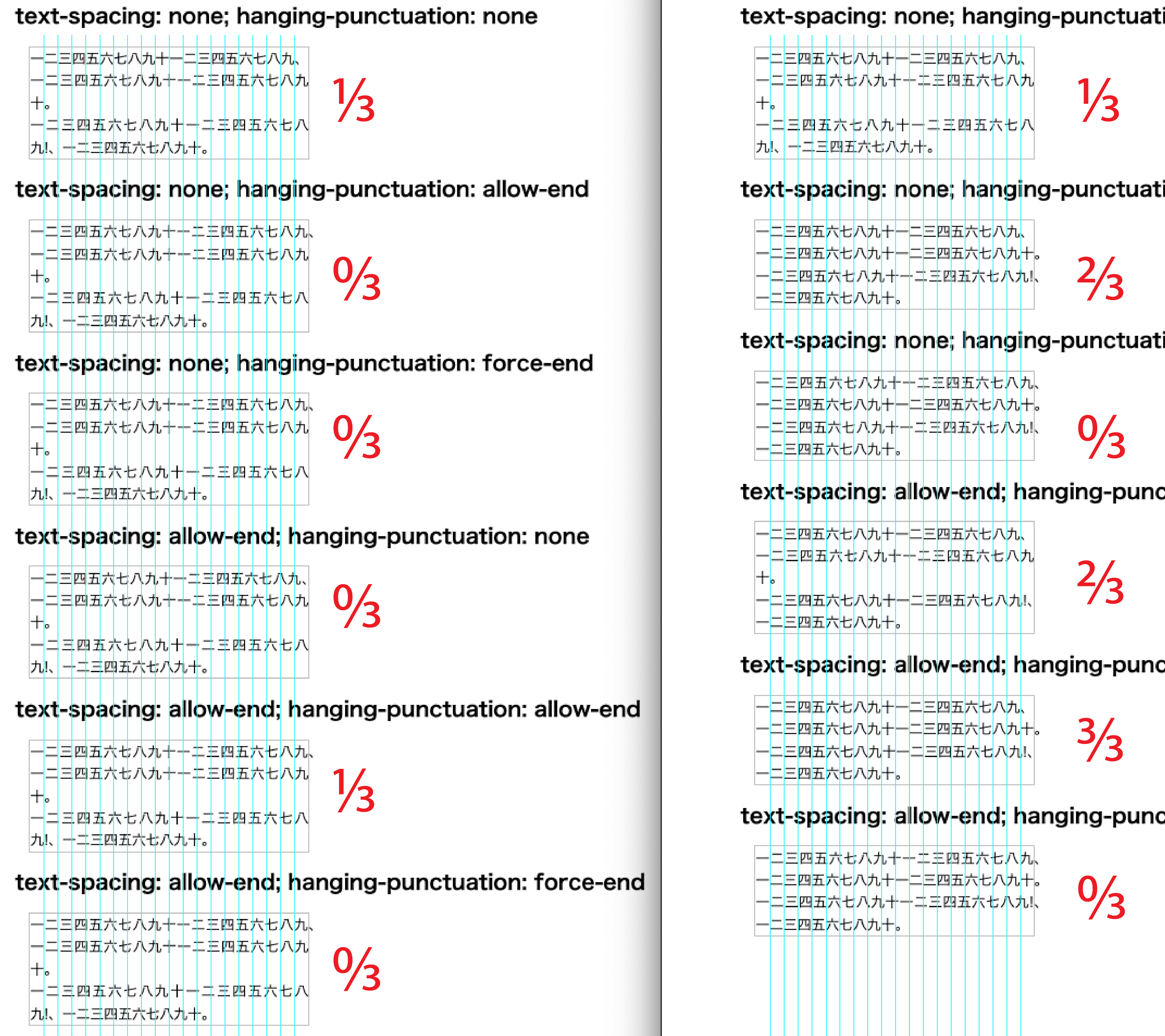
Nevertheless, the implementation at this point had some features not yet implemented. Figure 1 shows the same test page in the previous version v.2.13.0 (left, hereafter referred to as the “old version”) and the updated v.2.14.0 (right, hereafter referred to as the “new version”). You can view the same page in your browser by clicking the link below.
- Vivliostyle.js v.2.13.0 - Test page for
text-spacingandhanging-punctuation - Vivliostyle.js v.2.14.0 - Test page for
text-spacingandhanging-punctuation
The headings in the test page are the properties and their values that are applied. The sample sentences are all the same: the first line has an Ideographic Comma (U+3001) at the 10th character, which is the end of the line; the second line has an Ideographic Full Stop (U+3002) at the 11th character; and the third line has an Exclamation Mark (U+0021) and an Ideographic Comma (U+3001) are placed in the 10th and 11th characters. To make it easier to understand the behavior of the characters, we have drawn light blue reference lines at equal intervals of 16px each, the same as the character size.
Note that the reference line is perfectly aligned with the letter spacing of the first line of the first sample sentence. The spacing is solid (same as the font size) and aligned. As this heading says text-spacing: none; hanging-punctuation: none, this block has the properties text-spacing and hanging-punctuation disabled (none). So the result of typesetting is the same for both old and new versions. This means that if the inter-character spacing and the reference line are aligned, neither spacing reduction nor space expansion is performed. If there is a character before the reference line, some spacing reduction is performed, and conversely, if it is behind the reference line, space expansion is performed. Thus, by comparing the left and right typesetting results, you can check the changes in the new version.
Multiple Japanese typesetting available
Now let’s take a look at Figure 1. Notice the fractions written in red for each heading. This shows how many of the three lines of sample text were aligned with the inter-character spacing and reference line by applying the heading properties. In the old version on the left, except for the first block where the property was disabled, there was one 1/3 and four 0/3, which means that all the typesetting results were not aligned with the reference line.
On the other hand, what about the new version on the right, except for the first block, there are two 0/3, two 2/3, and one 3/3. In other words, there are two extremes: those that are not aligned with the reference line at all (0/3) and those that are aligned with the reference line a lot (2/3, 3/3). This is the evolution of the new version. In other words, you can now choose between two different types of typesetting.
It is generally said that “the basis of Japanese typesetting is solid setting. This is a way of saying that kanji and kana should be set at the same inter-character spacing as the character size (solid/full-width), but it does not describe everything. This is because the character advance of punctuation and parentheses is not solid.Another way of saying this is that there can be different methods within the same Japanese typesetting for how to format them. It can be roughly summarized into two categories.
- Give priority to aligning the head and end of lines.
- Give priority to aligning inter-character spacing with solid setting.
Of course, the difference between the two is not right or wrong, nor superior or inferior. It’s a matter of preference, which one you find easier to read. Let’s look at the red fractions. The blocks that are not aligned with the reference line, i.e. the third text-spacing: none; hanging-punctuation: force-end (right side 0/3) and the sixth text-spacing: allow-end; hanging-punctuation: allow-end (right side 0/3) corresponds to 1 above. Here, it is no coincidence that the value commonly applied to these two blocks is hanging-punctuation: force-end.
In the first place, the property hanging-punctuation: realizes so-called “hanging punctuation”. And if there are punctuation marks before and after the end of the line, the value force-end will be forcibly hung by either space expansion orspacing reduction. As a result, the line ends will be aligned, but on the other hand, adjustments will occur during the line, making it difficult for the inter-character spacing to become solid.
On the other hand, the second block text-spacing: none; hanging-punctuation: allow-end (right side 2/3) and the fourth blocktext-spacing: allow-end; hanging-punctuation: none (right side 2/3), and the fifth block text-spacing: allow-end; hanging-punctuation: allow-end (right side 3/3) corresponds to 2 above. What they all have in common is allow-end, but that’s not a coincidence, of course.
On the other hand, the allow-end towards hanging-punctuation: is hung only if certain conditions are met. Since there are fewer adjustments than force-end, it is easier to maintain solid setting. And another property, text-spacing, also has allow-end. Here, the punctuation marks and parentheses at the end of the line are basically handled like a full-width character, and in some cases handled like a half-width character. This also makes it easier to keep the solid setting. On the other hand, it will leave a half-width space at the end of the line, as in the first line of the second, fourth, and fifth blocks on the right, and the end of the line will not be aligned.It is up to you to decide whether or not you feel this is readable.
Finally, let’s take a look at the old version typesetting on the left. As a result, the end of the line is aligned. In other words, the typesetting of 1 above has been achieved, but the typesetting of 2 above has not been achieved.In other words, the old version did not allow you to select the typesetting that prioritizes solid setting, but the new version allows you to select this as well.
In this article, we have focused on the handling of line endings, but from the test page below, you can check the various typesetting properties of Vivliostyle.js. Please give it a try.